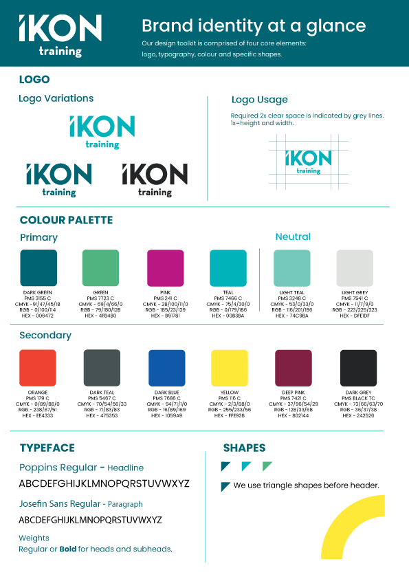
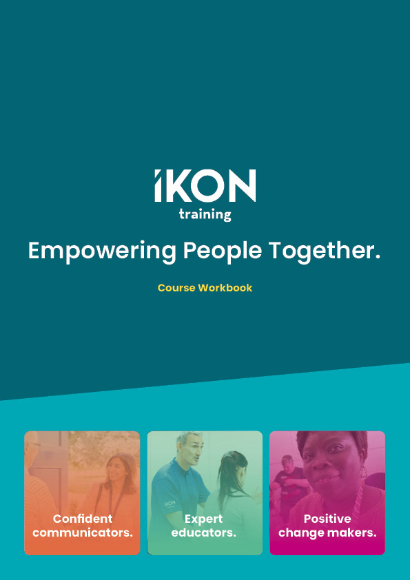
First, I developed the brand style guide for IKON Training to establish a cohesive visual identity and tone across all materials. This guide defined the core elements of the brand — including colour palette, typography, iconography, layout systems, and shape to be used — ensuring consistency and clarity in all communications. It also set the foundation for the design of the IKON workbook, aligning visual elements with the brand’s professional yet approachable personality. By maintaining a unified style throughout, the guide helped reinforce IKON’s values and enhance user engagement across training materials.
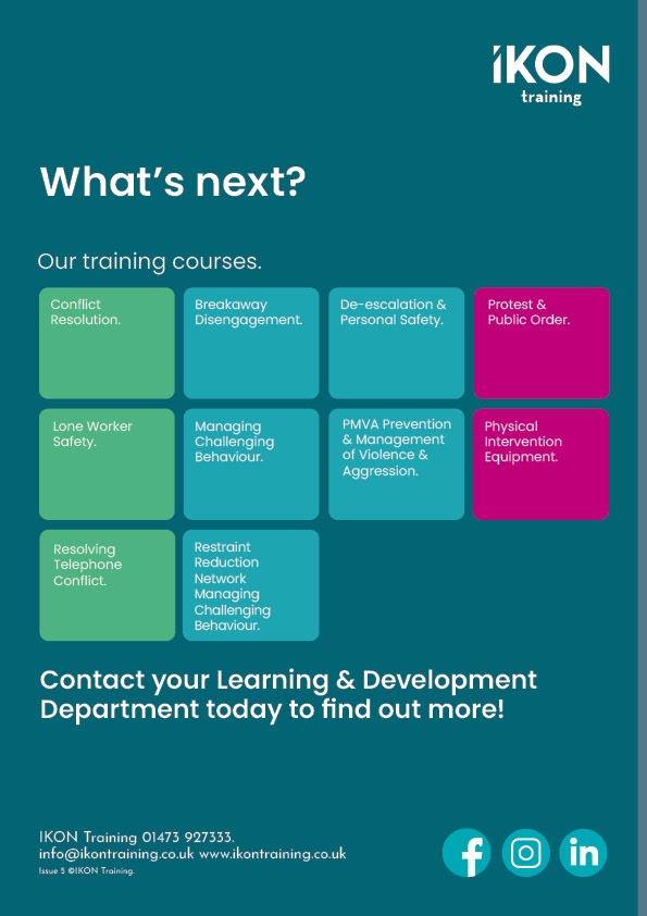
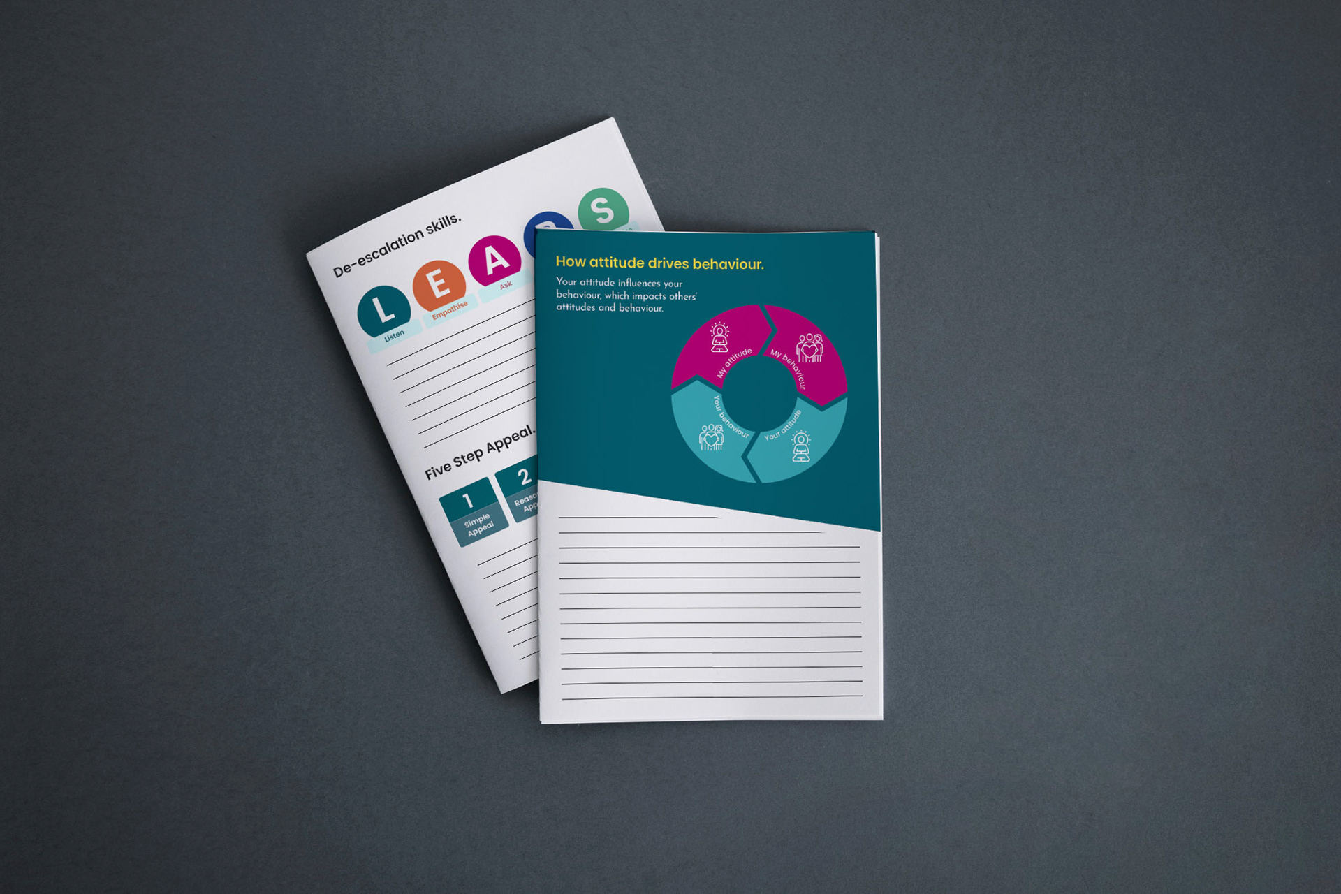
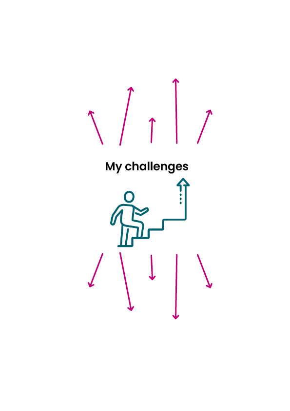
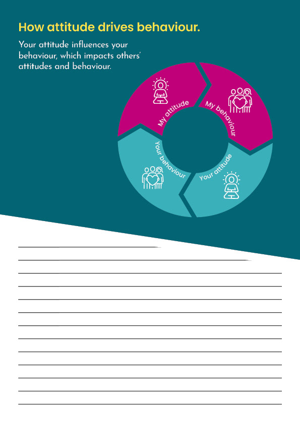
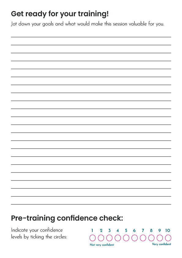
Later, I designed these workbook mockups in Adobe Indesign for IKON Training for on-site training sessions. The goal was to create clean, professional materials that enhance the learning experience while staying aligned with IKON's brand identity. These workbooks are used by trainers during live sessions, combining practical exercises, space for reflection, and easy-to-follow content layouts. The mockups demonstrate how thoughtful design can support both trainers and participants in a dynamic, real-world learning environment.

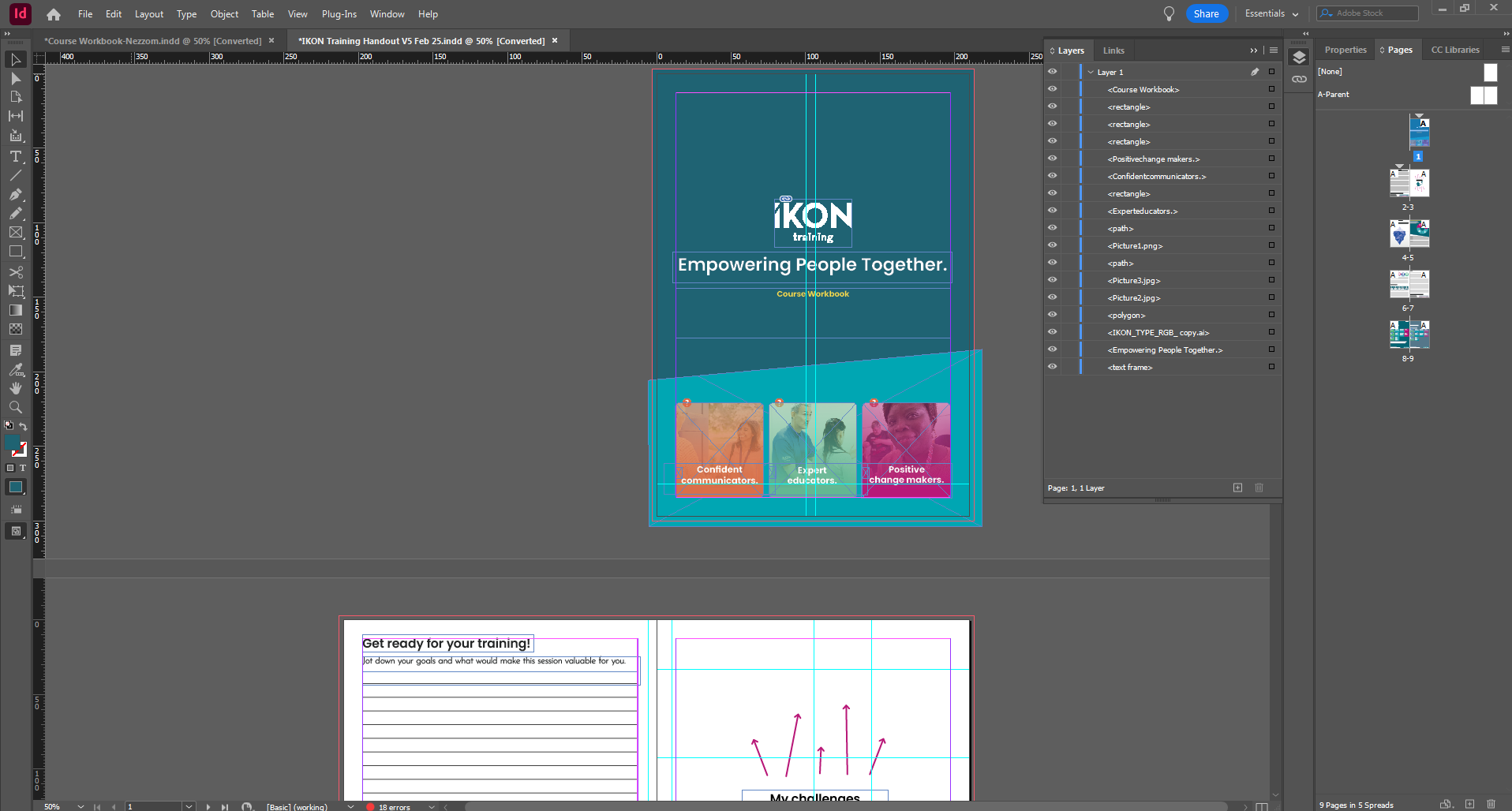
Indesign Workflow

Page 1

Page 2
Page 3

Page 4
Page 5

Page 6
Page 7